
NanoSpheRx Logo Design
As part of my work for Coalesce Corp, I was asked to design a logo for NanoSpheRx Inc. NanoSpheRx is a biotechnology company, so I wanted to develop a clean 'high-tech' look.
I started by looking at the websites of other biotech companies that had similar products.
As I started working on an intial design, I had these ideas:
- The logo wording should be black on a white background
- The Rx part of the company name should be a version of the 'prescription Rx' symbol
- One or more spheres should be part of the logo
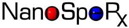
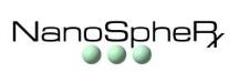
Based on these ideas, I came up with the initial design as can be seen below, with spheres of contrasting colors behind the 'o' and 'e':
I decided that the letters were too close to the edge of the spheres so changed the design as you see below:

As an alternate design idea, I used the same font and Rx figure but superimposed upon a single larger sphere:

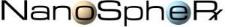
At this point I began working with different fonts for the logo text and decided upon 'Metro Extended' as the basis for the logo wording and Rx symbol. Below is the first logo design using the new font but with the original two-sphere design:
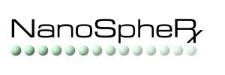
The client liked the font but wanted to see other design options for the sphere placement. Below are a number of design options with various sphere sizes, colors, and placements:

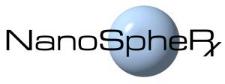
The client liked the sphere colors, but preferred the single sphere design. I came up with two possible placements for the single sphere:
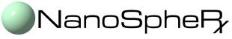
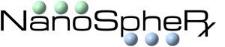
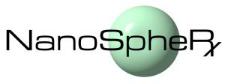
The client preferred the larger sphere behind the text, and was leaning toward the green color for the sphere:
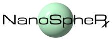
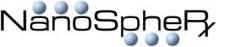
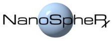
As a final adjustment, we moved the sphere to be behind the word 'SpherRx' in the logo text:
The client decided upon the green color for the sphere, resulting in the final logo design below:
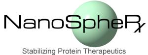
You can see the final logo on the NanoSpheRx web site: www.nanospherx.com.